Steve Laing | Creative Director
Creative Director. Art Director. Writer.
Steve Laing | Creative Director Steve Laing | Creative Director
System designs. User experiences. Strategy.
Whether it’s creating mood boards, style tiles, digital brand standards or directing teams through whiteboard or agile design sprints, I’ve clocked a lot of time directing design and UX teams as well as worked with strategy and dev verticals to create beautiful and smart design system experiences. From scratch or part of a templated component library. Below is a handful of projects and challenges I've lead.

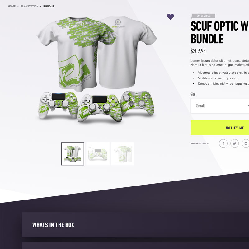
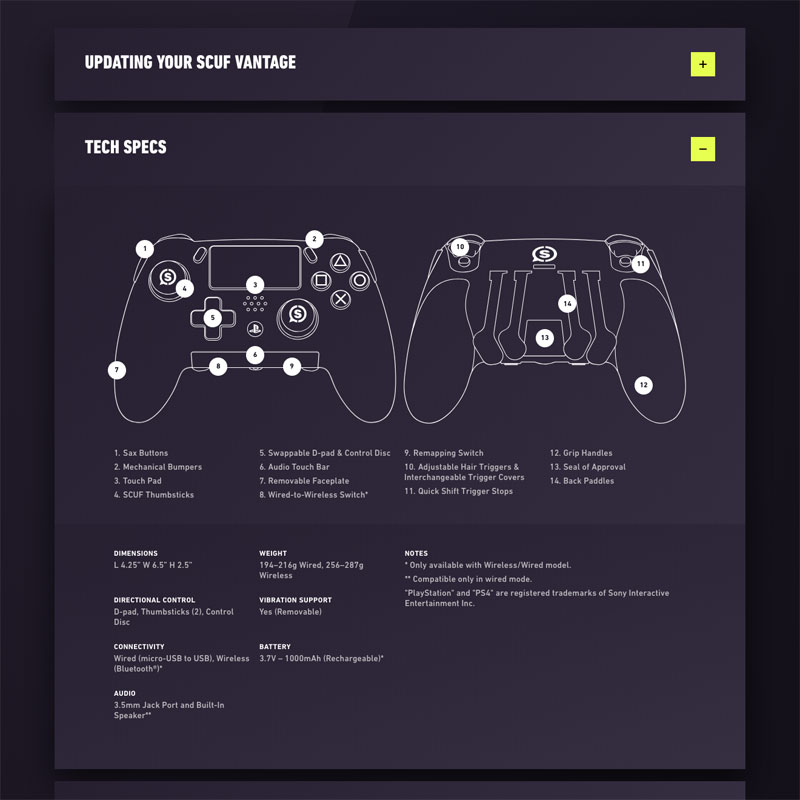
Scuf Gaming
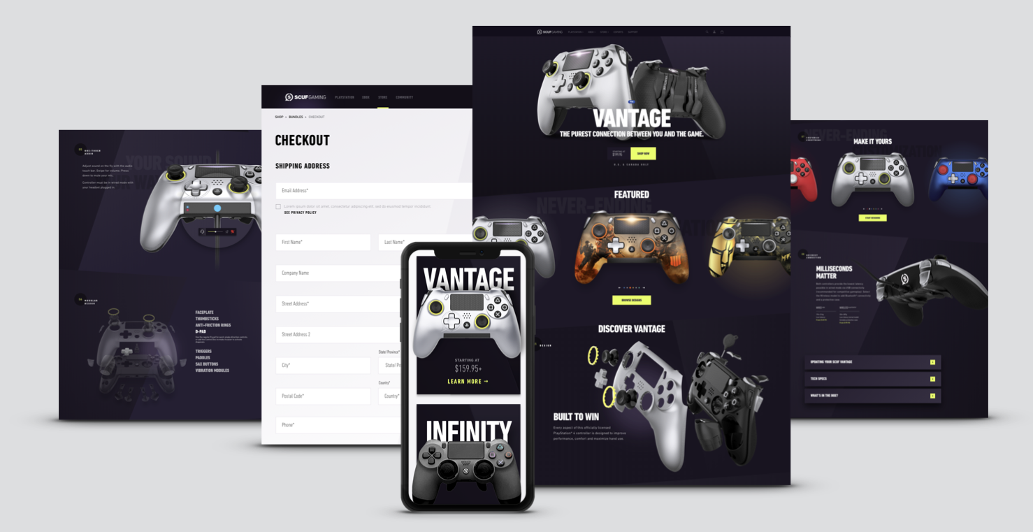
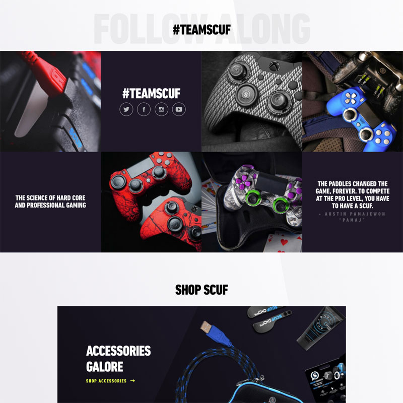
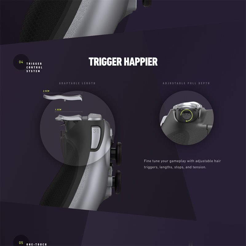
Scuf Gaming makes beautiful gaming controllers for a very passionate audience. Being experts on the topic of control we needed to create a web experience that matched the beauty and intuition of their product. Working directly with the Scuf executive team, I was able to gather requirements and a wish list of functionalities. From there I worked with our design and dev teams to create a site experience that was as intuitive as it was pretty - the perfect package, right!? Polished design, sexy photography, a robust commerce system and a customized controller configurator.

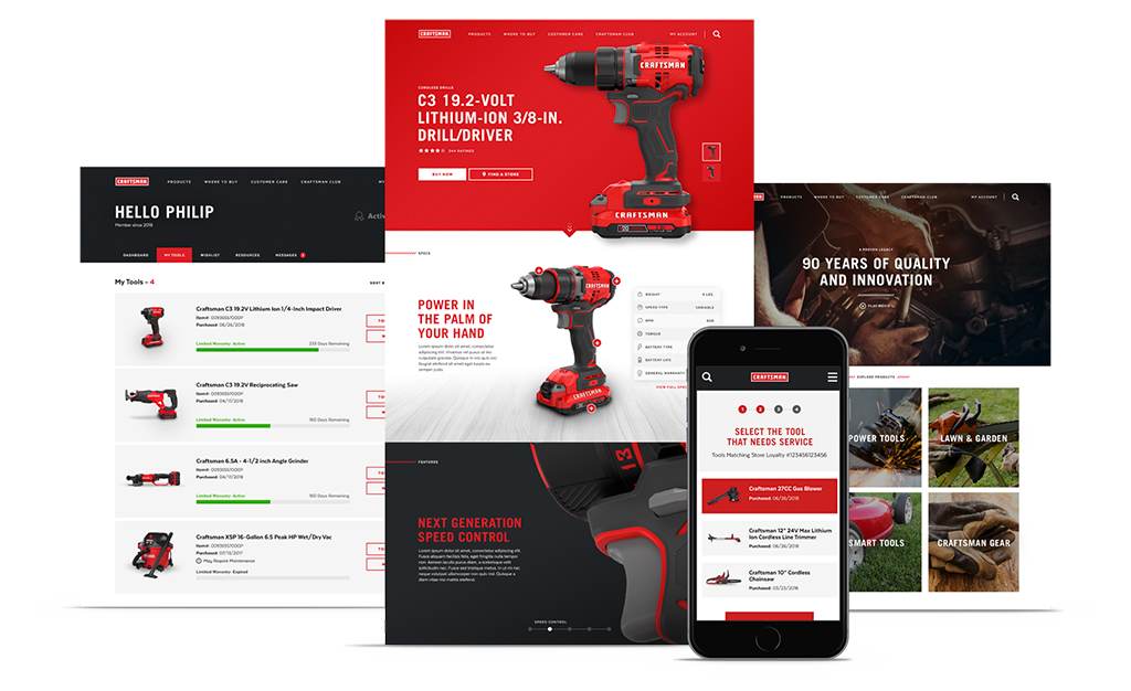
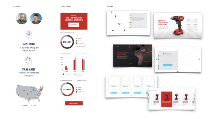
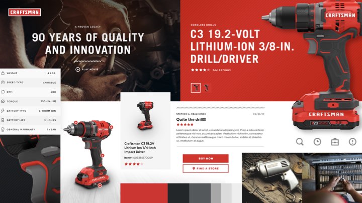
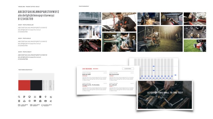
Craftsman
Craftsman was in desperate need of direction. We were tasked with preparing the brand for a relaunch to promote the “new and improved” product lineup and service. Starting with key stakeholder and customer interviews, I worked with leads from other verticals to narrow in on key strategic concerns and the pain points of their core audience. With that valuable insight in hand, I was able to direct the creative and UX teams through: mood boards, style guides, wireframes, components and eventual comps. The result was a potent blend of strategy, UX and design, emphasizing the craft of their product, the assurance of their customer service and the heritage of their brand.
Strategy audit, graphics and annotated module library.
Mood boards.
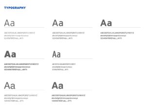
Web brand standards.

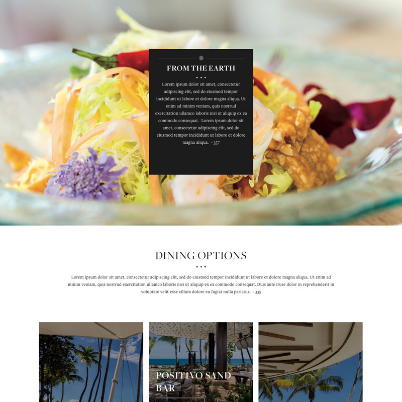
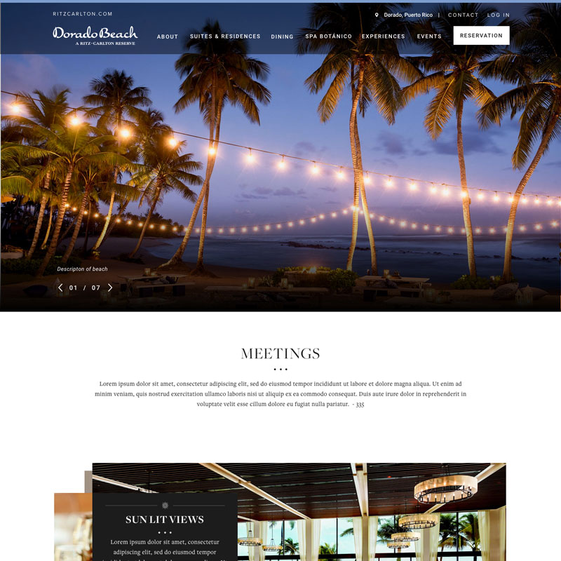
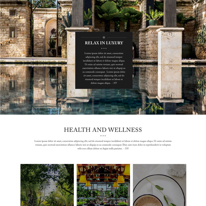
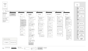
The Ritz Carlton
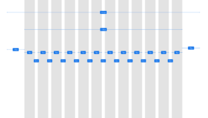
The Ritz Carlton Reserve owns a handful of luxurious property retreats. Starting with their Dorado Beach Reserve, we were tasked with creating a consistent, yet flexible design experience. Since all the properties needed to run from a consistent white-label CMS, we worked on organizing and optimizing the overall site structure and then trickled all the way down to the brand elements (fonts, colors, iconography) of each property. From there we built an experience that followed an overall consistent site structure but also allowed for slight customization giving each property a hint of personality. The designs were flexible, clean, ritzy, on brand and crafted down to the button.
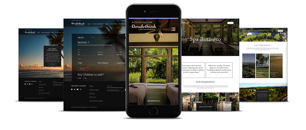
Site audit with annotated wireframes
Optimized grid system across breakpoints
UI/UX/design web standards library
Motion/animation prototypes

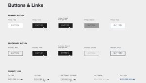
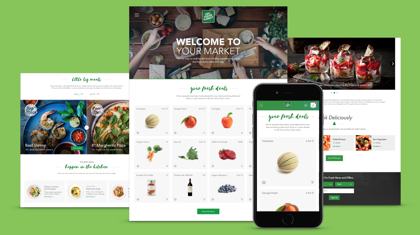
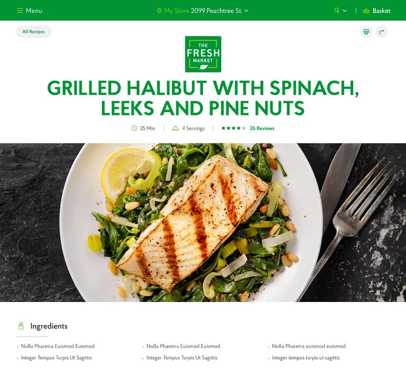
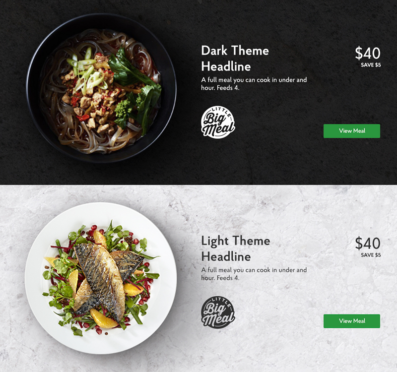
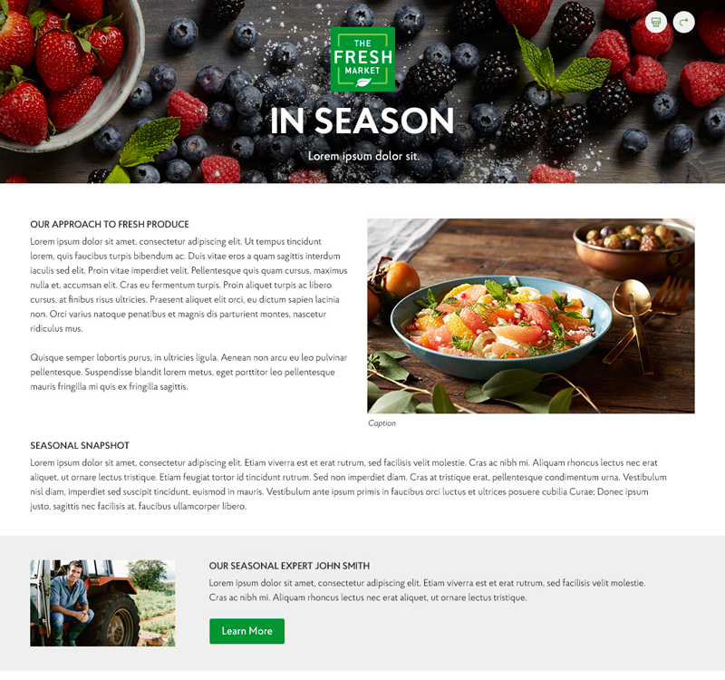
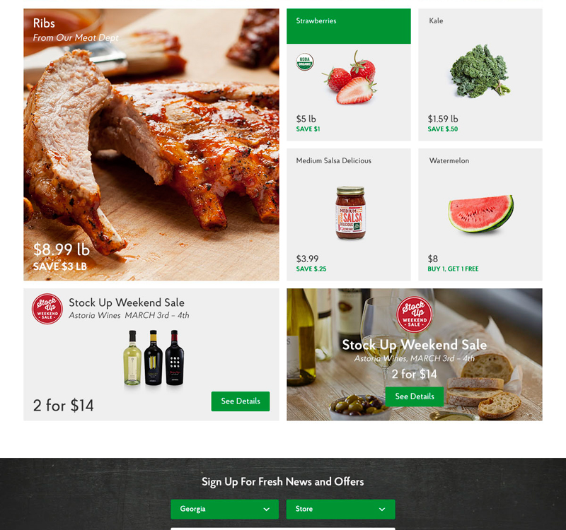
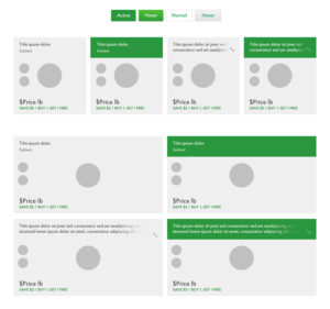
The Fresh Market
The Fresh Market came to us with a very dated and static site experience (literally, many of their pages were flattened PDFs). Their site was basically invisible from an SEO perspective. Starting with their brand style guide, I worked with teams to create a standard library of fonts, colors, UI, modules and fresh product imagery. We also created flexible and minimal component design library that would provide a cleaner, fresher look and allow the product to stay center stage. The result was a complete refresh of their old, cluttered site for a beautifully simple and fully responsive web experience. Not surprisingly, with all the content now dynamic, the site became a feast for search engines.
Weekly Circular -Before
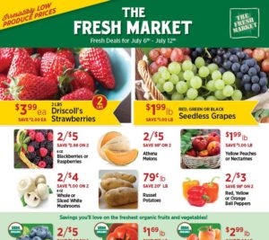
Weekly Circular -After

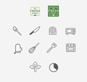
Complete iconography/graphic rebrand.
Digital style guide with standardized grids, fonts and color libraries.
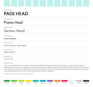
Flexible AEM component library.

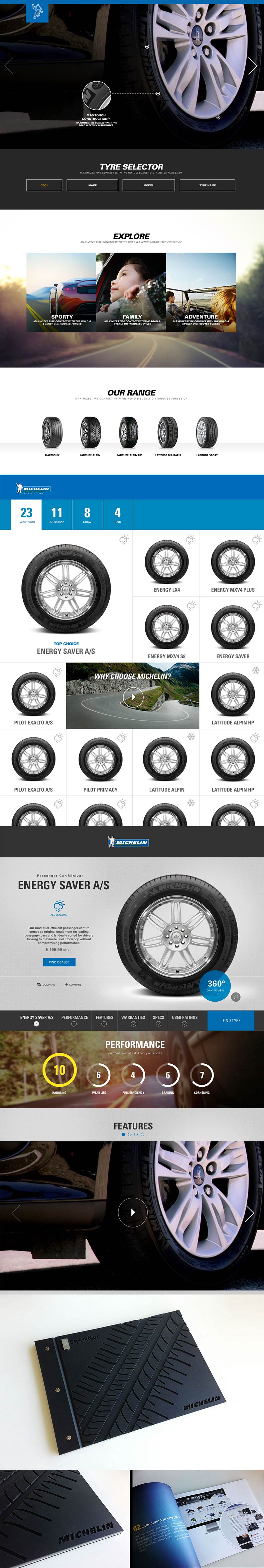
Michelin
Having been the Creative Director of record for two of the world’s largest tire brands, you might say that I’m a bit of a tire expert. The truth is, they’re a lot more important than we give them credit for. Everything you care about in your vehicle is riding on the surface contact equivalent to a sheet of paper. There’s a lot more to tires than rubber. This design project was meant to dial down the hard sale and dial up the passion of the product. Simple graphics, clean UI and slice of life photography. This design was definitely ahead of it’s time and has held up well. We even presented the strategy and brand standards in a custom-crafted, Michelin tire tread-etched book. (see below)
Web standards color palette creation.
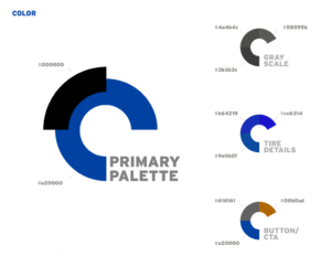
Web brand font family.
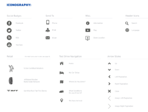
Web graphics/iconography library.